30th August was a day for the social media history books – the start of the end for the swipe-up link. Offering peak convenience, the swipe-up link allowed you to access an influencer’s shopping recommendations, find out more about important topics, or link through to a hot new blog post with the simple swipe of a thumb. Now, with its replacement by the link sticker, many brands and influencers are seeing shifts in historically reliable engagement rates – and not for the better. The important thing here is not to panic. We’ve been around a while and have weathered more than our fair share of platform updates, so we can confidently say that any drops in engagement are mostly down to familiarity, or a lack thereof. But as audiences take time to become accustomed to interacting with clickable links as opposed to swiping, there are some actions you can take to help increase clicks.
How to get more clicks on Instagram stories
So the swipe-up link is gone and your CTR is wilting. But before you start racking your brain for ways to overhaul your content or fretting about what you’ve suddenly started doing wrong, we think there’s a much easier route you should try first. Keep reading for our four no-fuss tips to get more clicks on your instagram stories.
1. Size matters
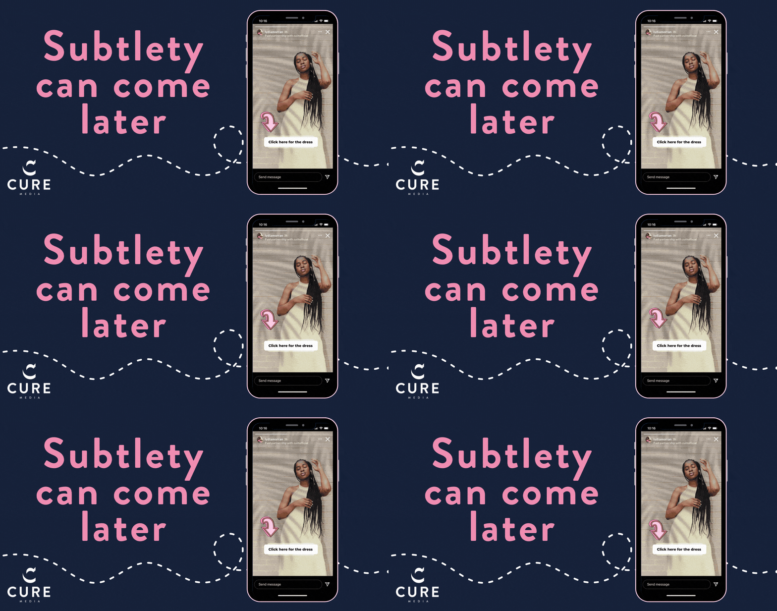
This is not the time to be shy about your link. The followers who used to engage are still there, they still want to see what you’re redirecting to, they just don’t know where to look so make sure your stickers are easy to spot by making them big. Subtlety can come later, right now it’s about making this transition as easy as possible for followers to grasp.
2. A little encouragement goes a long way
And let’s not be coy either! You’ve got your big link now direct people to it and we do mean literally. ‘Click here for my dress’ or ‘Tap the link to read more’ is going to be much more enticing than simply adding a mystery link to your story, no matter how big.
3. See the signs
Arrows. Hand-drawn, gifs, your own two fingers pointing the way. Using arrows to direct people to where they need to click, but also to connect the link visually to its destination can offer followers the assurance they need to make that tap. For example, if you’re posting a picture of a jumper to your story that people can click through to purchase, a simple arrow from jumper to sticker can go a long way to reminding people what the reward is if they do give the sticker a tap.
4. Take centre stage
This is not just about prominence – though it certainly helps. By placing your link sticker front and centre you avoid it being hidden by your handle or the message field or even by the invisible ‘next’ button. It also mitigates the risk that people using different phones with different screen sizes will miss out on the link entirely.

As audiences go through an adjustment period, don’t assume that using just one of these tips will be sufficient. In fact, before you implement even one of them, take the time to explain to your followers why you are using them and what has changed. While you might feel wary of bombarding them or coming across too aggressive in your promotions, remember that Instagram users in general are as bewildered by the change as influencers and brands are. Humans are creatures of habit and we had grown fond of our swipe-ups. But that doesn’t mean that just because the route has changed we don’t want to reach the same destination. With the right signposting and a little bit of time, link sticker engagement can and will achieve the same lofty heights as the swipe-up ever did.
(But that doesn’t mean we won’t miss it.)
Want to learn more about all things influencer marketing? Don’t miss our podcast! Each week, we cover topics around digital and social media to help you take your marketing strategy to the next level. Also, join the conversations with topic experts from the industry!


